

Project Overview
Hloopi, a Gen AI chatbot web app, is one of the innovative products of Factorise Solutions. It will serve as a cutting-edge AI-powered assistant providing real-time investment advice and insights. The project aims to create a seamless and engaging user interface (UI) that enhances user experience (UX) for both new and seasoned stock market investors.
This is a team project, I am working with another UX Researcher. My primary responsibility is to create the visual aspects of the web application, including layout, colors, typography, and overall aesthetic. Whereas, my team member focuses on the user experience by conducting research, creating user personas. We usually design the solution and test it internally with other designers/developers. Here, I have included the design solutions I have implemented for this project.
Things I did
UX Strategy | Wireframing | Visual Design | Prototype | Test | Front-End Coding
My Approach
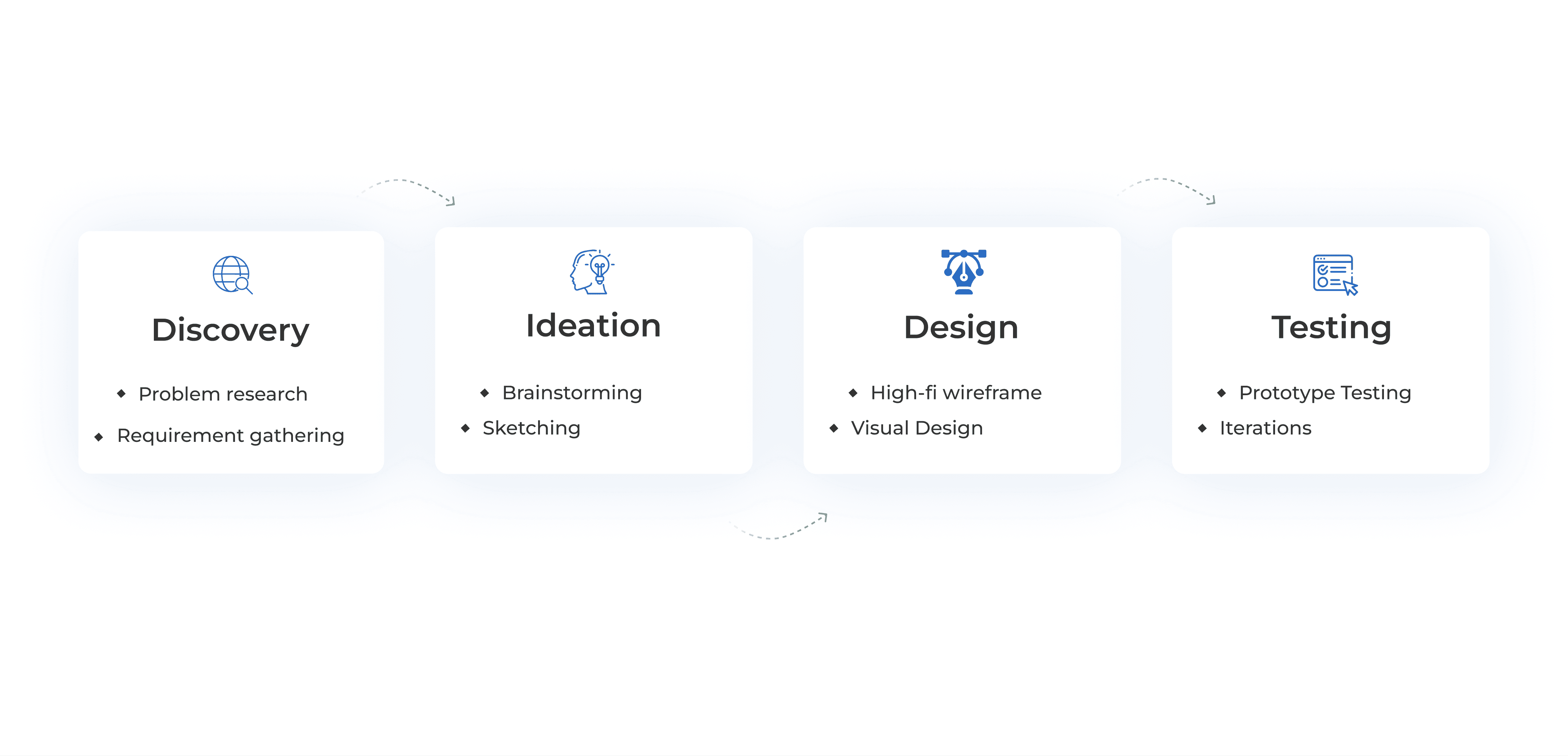
Problem & Solution

My journey began by understanding the needs of investors, both novice and experienced. Collaborating with our UX researcher, I gathered insights on the challenges they faced and what they needed from an investment assistant. With this foundational knowledge, I was ready to start shaping the visual aspects of Hloopi.
Brainstorming and sketch
Next, we brainstormed ideas. This was a fun and creative time where I sketched out different concepts on paper. I played with various layouts and styles to see what might work best. These early sketches helped me visualize how the app could look and feel.
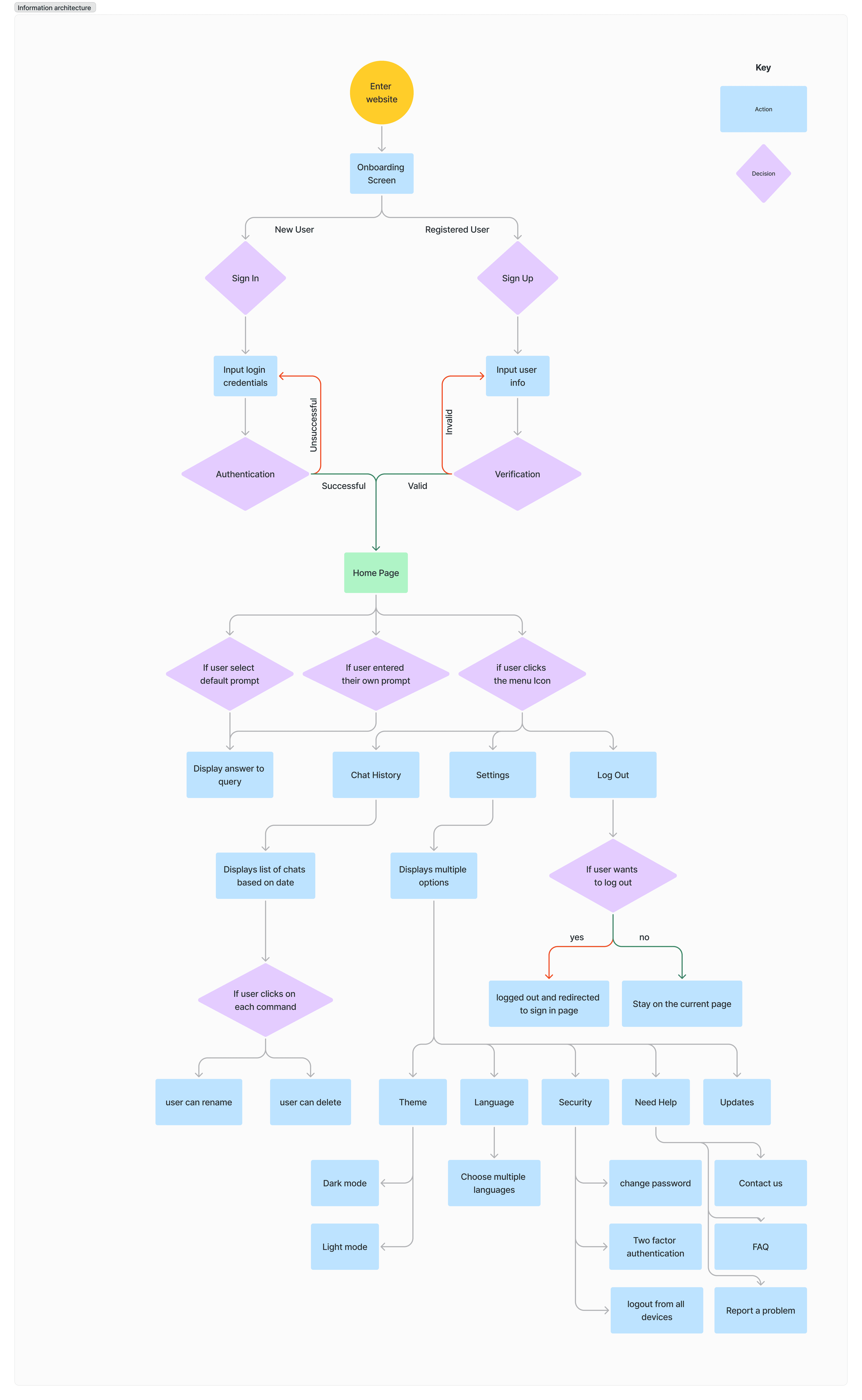
Information Architecture
This diagram illustrates the navigation and interaction paths within Hloopi, highlighting how users move through the application from start to finish. It showcases the logical flow and ensures a seamless user experience.
Creating Basic Wireframes
I then made low-fidelity wireframes. These were simple, black-and-white outlines showing the basic structure of each screen. I focused on where to place important elements like the login page, signup page, chat interface, navigation bar, and information panels.

These wireframes helped to ensure everything was easy to find and use.
High-Fidelity Wireframe
With the basic structure in place, I moved on to high-fidelity wireframes. These were more detailed and closer to the final product. I made sure each element was in the right spot and started to think about how the design would look visually.

Style Guidelines
Next, I worked on the style guidelines. I picked colors that matched Factorise Solutions brand—calm blues to build trust, with bright colors for important actions. I chose fonts that were easy to read and looked professional. I also decided on the use of icons and buttons to create a consistent look.

Visual Design
I then applied the style guidelines to the high-fidelity wireframes, adding colors, fonts, and other visual elements. This made the design look polished and professional. I paid close attention to details, making sure everything looked good and was easy to use. The chat interface was designed to be friendly and clear, with easy-to-read text.

After finishing the visual design, I created a high-fidelity prototype. This was an interactive version of the app that users could click through. We tested it with internal team, gathered feedback, and made improvements. Each round of testing helped us refine the design.
Time for Code and Coffee
With the design approved, it was time to bring it to life. I started setting up the development environment. We chose React JS for building the user interface because of its flexibility and efficiency. To ensure the design stayed true to the approved visuals, I used Tailwind CSS, which allowed me to apply styles directly in the markup and maintain a clean, consistent design.
Conclusion
Working on this project help me on the collaboration with designers, cause every designer have their own way of doing things. Project was challenging and our internal design design discussion helps in so many design iteration and finalizing the UI for better and optimized results. Overall, designing Hloopi was a rewarding journey. Each step, from initial sketches to the final prototype, was important in creating the final product. This experience strengthened my passion for design and my commitment to creating user-friendly interfaces.

